12 Feb 2025
upd: 25 Aug 2025
Is Pantone's Color of the Year Fashion's Yearly Horoscope?
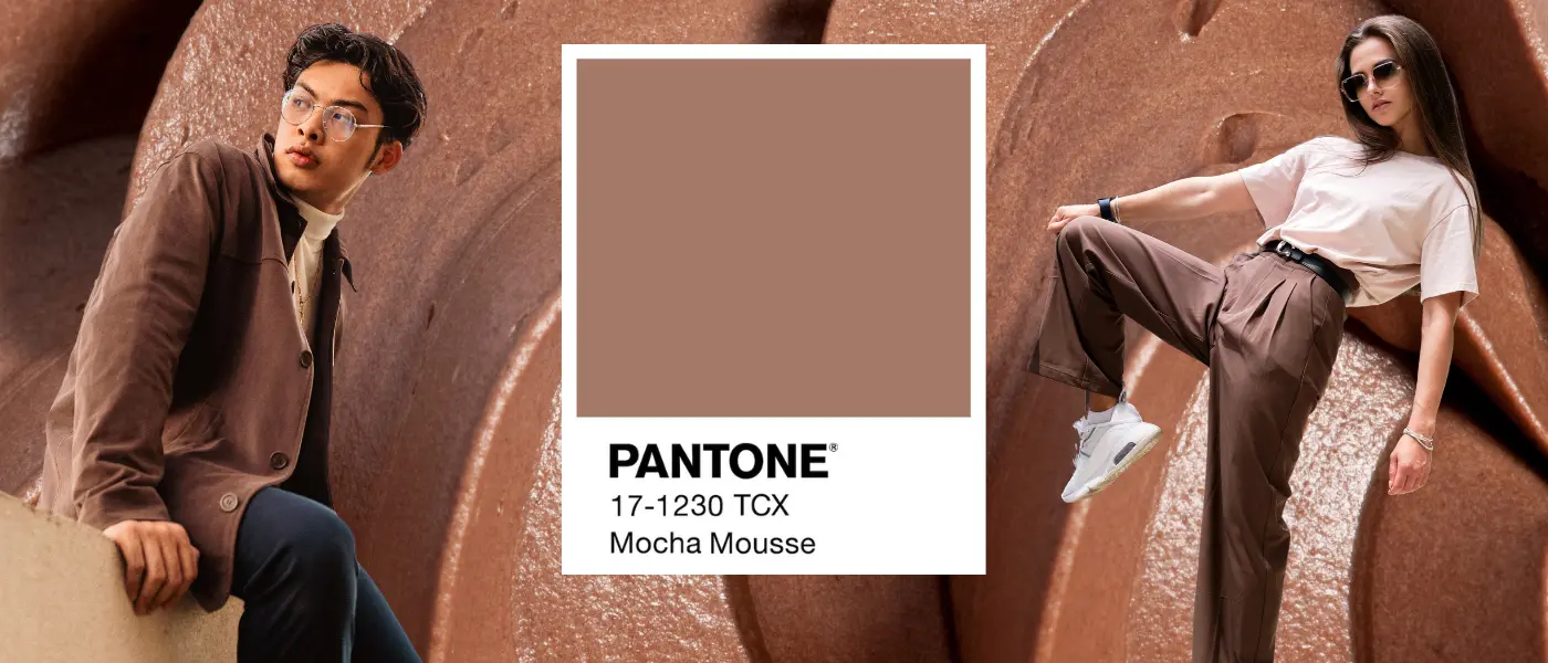
Like a yearly horoscope, but much more factual, Pantone’s Color of the Year sets the tone for the fashion world. Below, we consider how the Pantone choice influences trends and what it may portend for the year ahead. The influence of Pantone’s Color of the Year extends to all forms of design, but I will be covering only fashion, since, what else really matters? (Just kidding). This year’s selected color is Mocha Mousse. A shade of brown reminiscent of chocolate or coffee, these comparisons bring the color a warm and comforting feel to the eye. So what does this say about the upcoming year we will have in fashion?

Mocha Mousse & Quiet Luxury
In the past, fashion has taken a back seat to loud, eye-catching styles fueled by social media-think chunky gold jewelry, neon colors, and layered maximalist looks. We can also see this vibrancy in the past two shades of the Pantone Color of the Year: Viva Magenta and Peach Fuzz. The two pinks drive a bold, celebratory mood. But now with Mocha Mousse, what was once a loud, vivid landscape may give way to the onset of beiges and nudes. The tameness of this hue leads to thoughts of much more subtle and calm aesthetics. Not very surprising, considering the rise of the Quiet Luxury trend, which might have steered Pantone to such a more stable and firm earth color. Quiet Luxury is about craftsmanship and timelessness. The consumer invests in quality over quantity and in long-lasting, well-made clothes rather than the compulsive buying of trending pieces. It fosters a more conscious consumer. But what does Mocha Mousse reveal about our upcoming 2025?

Pantone vs. Astrology: A Fashion Trend Predictive Analysis
While not quite as vivacious as 2023’s Viva Magenta, Mocha Mousse offers respite and solace from uncertain times. People might go to their closets this year in search of a calmer look that cocoons themselves from the world outside. Hence, a minimalist wardrobe. I compare the Pantone color of the year to the concept of horoscopes since the process of determining either one is rather similar. An astrologist will look to the sun, moon, and planets for positioning and their alignment to predict what’s in store. Meanwhile, Pantone studies cultural shifts, fashion trends, and zeitgeist to come up with the Color of the Year. What is evident is that fashion has this interesting way of reflecting society at large, usually resulting in people dressing in a way that is opposite to how they feel. It begs the question: Did Pantone choose such a warm neutral to balance the craziness that’s coming with this year?

Share with
Comments (2)
Comments are disabled.
★★★★★
★★★★★
The Color of the Year often brings mixed feelings. On one hand, it’s an interesting starting point; on the other, it’s not always clear how much it actually influences design choices. Sometimes it feels more like a symbol than a practical reference.

Get in touch
Call Us
1.305.555.5555
Compliance and academics cell
786 656 8239
Chat on WhatsApp
786 329 0023
Email Us
miami@immiami.com
Mailing Address
3704 NE 2nd Ave, Miami, FL 33137
Advance Your Career in Bachelor’s In Fashion Business
Our article, "Is Pantone’s Color of the Year Fashion’s Yearly Horoscope?", delves into the heart of this topic, offering fresh perspectives and inspiration for fashion enthusiasts. It shows how the idea resonates with today’s creative minds and influences the trends of tomorrow. By examining real-world examples, it reveals the strategies and ideas driving forward our industry.
If you’re ready to turn your passion into a career, our bachelor’s in fashion business program equips you with the knowledge and skills to thrive. From strategic thinking to hands-on practice, you’ll learn to turn ideas into reality.
At Istituto Marangoni Miami, we nurture future leaders in fashion and design. Join a community where creativity meets business. Begin your journey today and help shape the future of style. Embrace the journey to become an industry innovator.
The Color of the Year often sets an exciting direction for designers and inspires creative experiments with palettes. It’s clear to see how different brands approach it—some boldly incorporate it into collections, while others add subtle accents. This trend helps refresh and energize fashion.