Array ( [es] => Array ( [id] => 50 [order] => 0 [slug] => es [locale] => es-US [name] => Español [url] => https://www.istitutomarangonimiami.com/es/blog/color-pantone-del-ano-comprension-de-su-impacto-en-el-diseno-de-moda/ [flag] => https://www.istitutomarangonimiami.com/wp-content/plugins/polylang-pro/vendor/wpsyntex/polylang/flags/es.png [current_lang] => [no_translation] => [classes] => Array ( [0] => lang-item [1] => lang-item-50 [2] => lang-item-es [3] => lang-item-first ) [link_classes] => Array ( ) ) [en] => Array ( [id] => 91 [order] => 0 [slug] => en [locale] => en-US [name] => English [url] => https://www.istitutomarangonimiami.com/blog/pantone-color-of-the-year-understanding-its-impact-on-fashion-design/ [flag] => https://www.istitutomarangonimiami.com/wp-content/plugins/polylang-pro/vendor/wpsyntex/polylang/flags/us.png [current_lang] => 1 [no_translation] => [classes] => Array ( [0] => lang-item [1] => lang-item-91 [2] => lang-item-en [3] => current-lang ) [link_classes] => Array ( ) ) )

DEADLINE TO APPLY: Thursday May 2nd , 2024

Whatsapp Text Call
Menu

DEADLINE TO APPLY: Thursday May 2nd , 2024

Pantone Color of the Year: Understanding Its Impact on Fashion Design

Pantone Color of the Year: Understanding Its Impact on Fashion Design

Pantone Color of the Year: Understanding Its Impact on Fashion Design

Uma Peña-Cabrera, Student Writer

25 Apr 2023

What is Pantone?

Pantone was brought to life in 1963 through the printing industry. At the time, there was a need for a solution for color matching and its continuous complications. Thus creating the ‘Pantone Color System.’ The Pantone Color Institute allowed designers, marketers, creators, and brands to work together. 

Introduction of The Color Of the Year

The induction for the color of the year dates back to 1999. In its inception, the premise of Pantone Color of the Year was to create an educational format to bridge the gap between colors and cultures. Creating this level of communication helps to bring in the community through artists, designers, and all other color enthusiasts. At its core, Pantone contributes to universal language through colors that can be used to make critical decisions throughout the various stages of a brand or manufacturing workflow process

‘Color of the Year’ in itself is a trendsetter. Through research, the Pantone panel helps us set the tone through color communication. Pantone researchers take on the perspective of looking at each year objectively and choosing a distinct color that reflects the global culture. Inspiration for the new color influences is pulled from all things around us. The entertainment industry, travel destinations, films, lifestyle, and socioeconomic status, to name a few. Selection and research for the color of the year take about 9 months. So much time is allotted to the Pantone color of the year choice because it is important that the emotional aspect takes precedence as well. What do the colors make us feel? The color of the year for 2023 is the bold and lovely ‘Viva Magenta!’

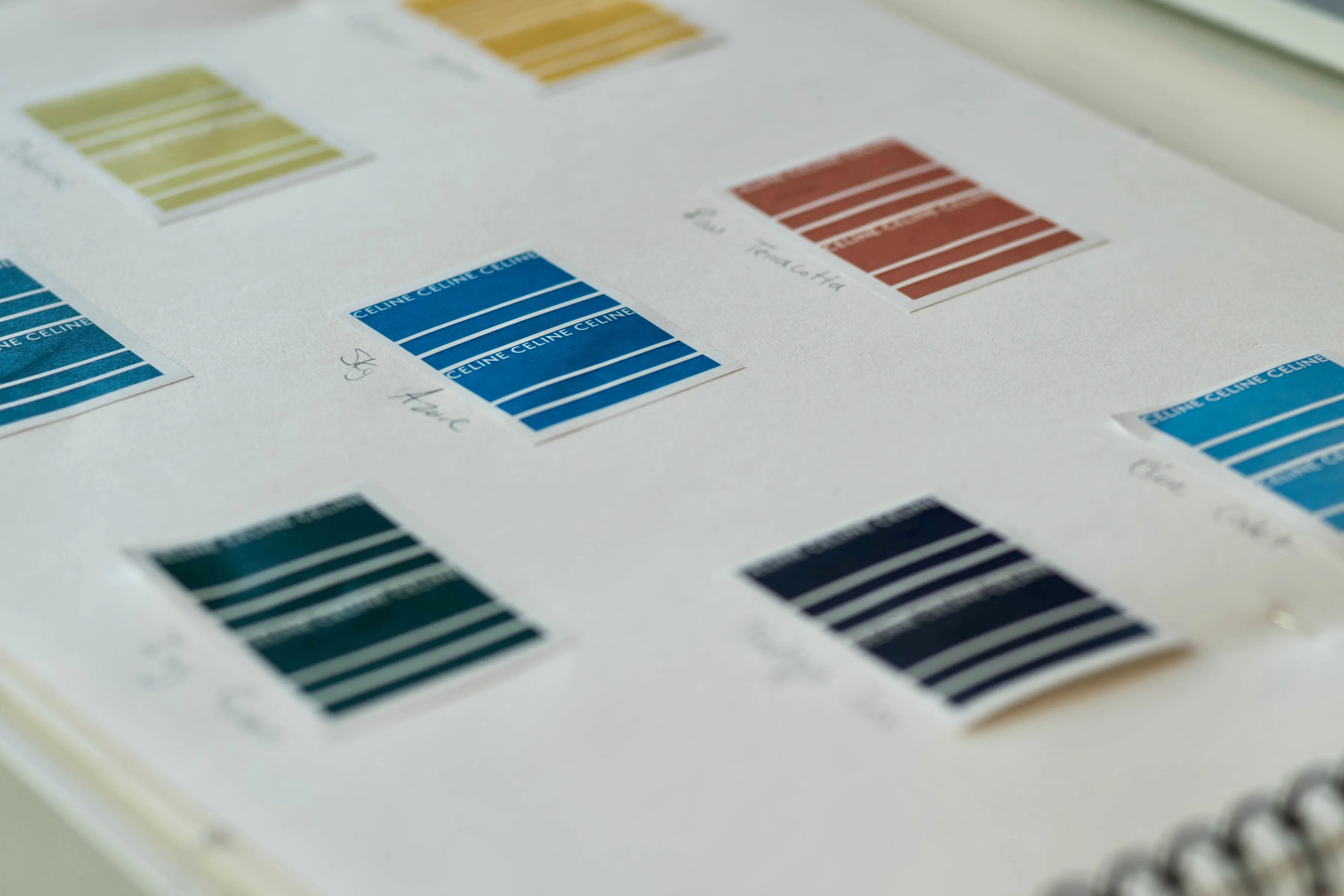
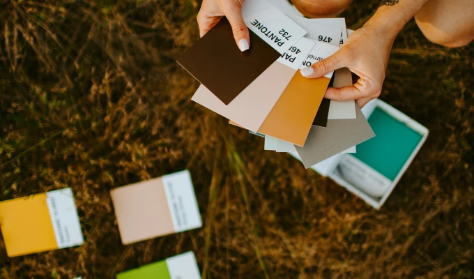
Pantone Color Connections & You

One of the main objectives of the Pantone color selection is to evoke emotions. In past years some of the colors chosen have been Classic Blue (2020), Illuminating & Ultimate Grey (2021), and Very Peri (2022). While collectively we may favor some colors over others, Pantone color of the year generates choices based on communication of the global culture at the time. In many ways, the year’s color reflects our global state. Each color represents its dynamic personality, from dull to bright. It is for this reason that Pantone works to generate the expansive catalog of colors that it has. In the fashion industry, colors are what moves us the most, aside from silhouettes.

For example, the color of the year for 2023 is described by Pantone to be ‘vibrating’ and bring ‘vigor’ to the table. Announced in late December of 2022, Viva Magenta is a descendant of the red family. Viva Magenta shows strength and duality. Emotionally, this breeds a certain perspective shift and determination within us, especially, in moving through a post-pandemic world.

Pantone Color of The Year: Where Can We See It?

You can notice the subtleties of the color of the year appearing anywhere. In commercials, editorials, paintings, and interior design. One of the largest spaces that you will most likely begin to notice Viva Magenta (or any Pantone color) is within an interior design setting. Whether it’s an office set up or even in a pop-up shop, you can often note the Pantone color of the year by how the room is accented and decorated. Another note on finding the color of the year is how it is communicated through art. Pantone encourages artists of all mediums to pay attention to Pantone color selection. Art pieces like paintings and sculptures can also communicate the color of the year. When Pantone colors are used in these specific mediums, it layers in further color communication through the interior design lens. Spaces like stores, coffee shops, or even libraries, become more interactive through the use of Pantone colors, specifically with the color of the year.

As we dive deeper into the year, keep your eyes open to the ways of Viva Magenta. Challenge your creativity by incorporating the Pantone color of 2023 into your daily styling or collection designs. Also, continue to allow the colors around you to speak to you. You might just be able to pick up on next year’s Pantone color of the year.

Art & Design
Color of the Year
Fashion Design
Pantone
Student Writer
Uma Peña-Cabrera
       

CONTACT

miami@immiami.com
305.424.9434
3rd Floor Office - 301

OFFICE HOURS

Monday - Friday 9:30am - 5:00pm

Upcoming Events